Visual representation of wealth scales
Credit: Inspired by the visualization tool “Wealth, shown to scale”
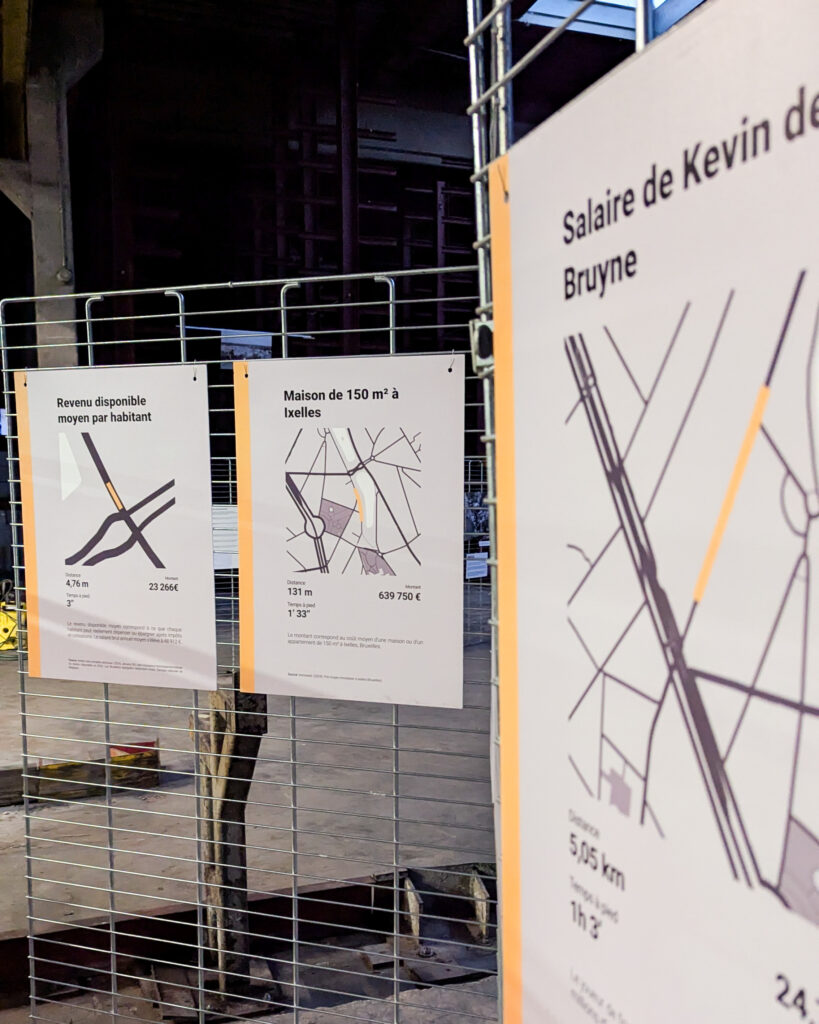
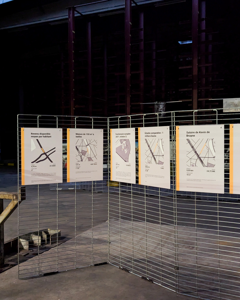
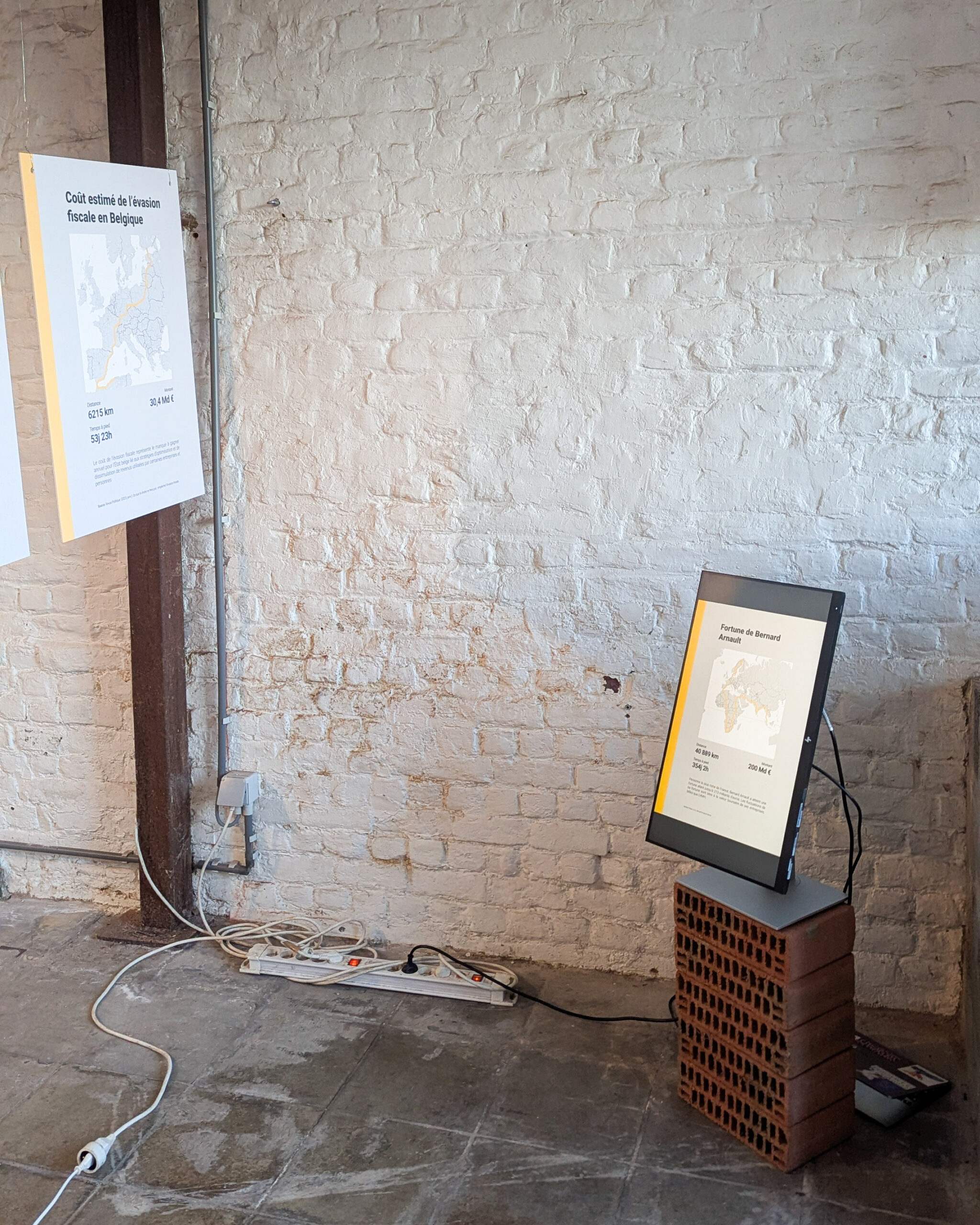
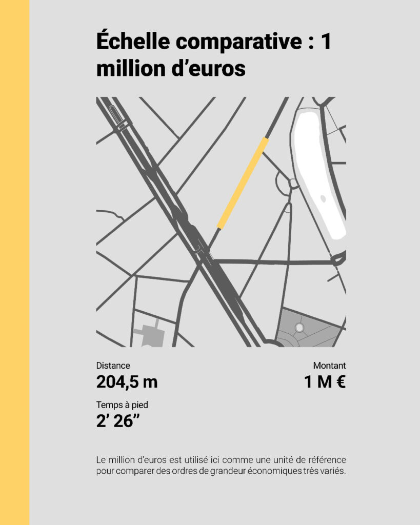
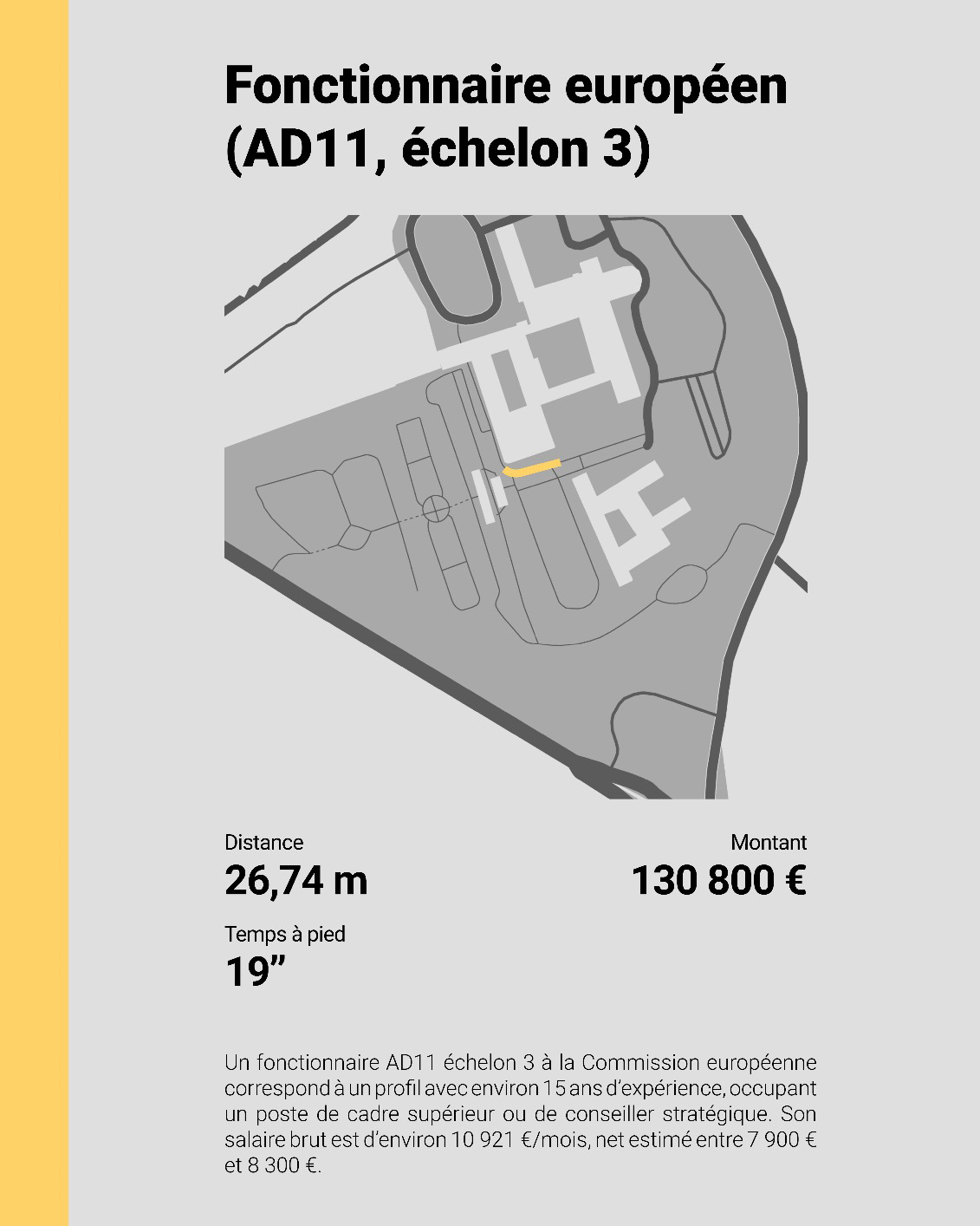

A set of visual supports and projects that compare different economic amounts, from the average Belgian income to billionaires’ fortunes. These amounts are translated into concrete formats, distance covered, time elapsed, volume, surface, to make them more tangible, understandable, and above all more comparable. The aim is to highlight the scale of economic inequality and the way it is often made invisible through abstraction.
The project draws on the work of economists such as Thomas Piketty and Gabriel Zucman, who study wealth-concentration dynamics and the inefficiency of current tax systems in the face of large fortunes. It turns those numbers into something visible, concrete, and a little unsettling.
Opensource 3D files available here